Monday 16 December 2013

LF: Final Printwork


  • There is a clear link between the three products where we see the prevalence of john, always key in frame. This develops the advertising campaign and enhances the band image.
  • The production studio connected with the artist, symbol is present in the bottom right corner, but mainly the text is big and bold using a light colour on a darker background so it is easily recognized. 
  • The only thing in focus is the protagonist which is done by using a shallow focus, so the audience focus on the foreground of the shot, and the background is portrayed as less important to show the text is mainly about a certain character.

Friday 13 December 2013

Group: Joe Hertz - At Your Touch


This is our final piece. It includes many of the different shots we wanted to incorporate in our work either as a pastiche or as part of inter textual relay. The protagonist plays a prominent role the text, with most pf the close ups and shots focused on him, creating character exposition and relationships between the character and the audience. There are clear links between all the texts, which include the location of London, which is seen on the digipak, and the protagonist is the main theme of the two advertisements. This has developed our band image and brought forward the campaign.

Thursday 12 December 2013

Group: Audience Research Plan

Survey Monkey:
To get as much feedback and to receive the high validity in our audience research, we are going to create a questionnaire on 'Survey Monkey' which has a variety of open and closed questions, starting with closed and ending with open. This will give us qualitative and quantitative data to gain the most feedback as possible. We will send this out via the social networking site Facebook, which will give us feedback of the target audience of young and adolescent people, which are the generations most related to the genre of the track.

Focused Group:
We are also going to carry out a focused group audience research where we will get a small group of friends who will watch the video, and relating to some questions that have been produced, answer them to the camera. This will give us more control over the demographics and give us a chance to choose the correct audience in order to receive the highest quality feedback from the target audience.

Wednesday 11 December 2013

CJ - Colour Balance

  • Colour balance is the process of changing the level of colour within the visual (Red, Green, Blue). The image altering tool is used to either give the visual a colour grade or just to bring out certain colours. The group used colour balance for the last minute of the video in order to drain the colours, reinforcing the idea of sadness and sorrow.
  • The screen shot shown above shows an example of colour balance used alongside black and white.We altered the colours of the picture scene to help give the audience an understanding that it is a flashback of the past.

Monday 9 December 2013

LF: Print Work


This is my first print design which has the name of the artist and title of the song prominent in the advert. The layered shot behind reveals the three boys in London together showing a loving friendship and a close relationship. This reinforces the narrative in the video, where we see the boys having fun. The contrast of the image has been improved to depict the sharp colours and create a happy mood.


This toolbar shows the different layers in which I have used to create the images. In the adverts like the one above and the advert where the title and artist is on the skyline, every letter is used on a different layer. This enables me to fit in all the letters individually to make the most of the space and make it look symmetrical.

The bottom two layers involve the two images used with 50% opacity, so there is a sense of layering in which you can see the group of boys and the NVC of john, the boy who has a terminal illness.


This advert to the left carries the same effect of the layering and the individual letters but is also shows the NVC of john a lot more clearer. The skyline is one which is symbolic to London which relates to the video and the layered image represents John looking down on his last day spent in London.


This advert recognises the recording studio the artist Joe Hertz uses for this song. The image is a still from the video so the character is present in the advert and music video, bringing forward the campaign and image of the track. There is many signifiers in the image, such as the hat and glasses which signify embarrassment and sympathy and that the ill boy is trying to hide his face because he doesn't like who he is or what has happened to him. Also the fact he is looking down connotes the mood of sadness.


My final advert design is a development of the last, now including the title of the song which is very important and the recording studio symbol has been made smaller as it is not a design that needs to be central to the advert. I have included a review of the artist which reads 'Making his breakthrough album - New upcoming artist Joe Hertz' which will catch the eye of the audience and influence their decision to purchase the music.


JV - Editting Post - Layering

The ending involved clips overlapping each other by altering the opacity of the footage, in this case the opacity levels are 65%. This shows that John is now less prevalent in contrast to the graveyard ending. The transitions also help the continuity of the footage by providing a smooth introduction for the clip of John with a cross dissolve and dip to black.

Thursday 5 December 2013

LF: Editing Post


  • Our last scene involves the reactions of the boys after hearing the news and the graveyard scene where some of the boys go to see his grave.
  • The popped up icon on the screen in the picture above shows the time stretch tool that enables you to either produce a slow motion clip, or to create some sort of time lapse. In this scenario, it is all in slow motion to allow the audience to connect with the NVC and the emotions of the boys.
  • The audio is matched with the visuals continuing the good continuity throughout the whole piece.
  • The cutting rate is a lot slower in this scene which lets the relationship between the audience and the character get stronger.
  • We have tried to create verisimilitude by varying the emotions and reactions of the boys.
  • All the time stretch's are set at 25% so it is 4 times as slow and real life.


Here is the timeline as it looks at the moment. The track doesn't start until the present narrative begins, as there is a prelude of the boys and john at the hospital, as john receives the news, where we have ambient and diegetic sound to anchor the visuals. The track enters with the time lapse of the sunrise. We have had to cut down the track, from 4.14 to roughly 3.30, but we have cut it at a slow tempo and quiet part of the song so it doesn't seem like an unrealistic ending to a song. Also the soundtrack slowly lowers in volume at the end, to end the song in a melancholy way, which reinforces the visuals of the layered footage of john breaking the fourth wall, on top of the boys walking away from the grave.


Wednesday 4 December 2013

LF: Reaction Scene


On Friday 29th of November, we went out to shoot our final piece of footage we needed. This is a scene where the boys are all together and they are looking back on johns life, through old photos and their reactions to the news they have heard.
We used many different camera techniques including;
  • Deep and shallow focus
  • Establishing shots
  • Panning shots
  • Close Ups
We encountered a few problems such as lighting and the effect that had with the camera, it was at night so the inside lighting did look very orangey yellow, which disturbs any post production effects we may include. I have included a time stretch tool which has made the footage 25% of the pace, and a black and white effect to show it is not in the present narrative.


The scene has been re-edited to make it look a lot better.
Post production effects:
The black and white effect drowned out a few colours, making the blacks look grey and the whites a lighter grey. Therefore we have added an affect called colour graduation (RGB) which allows you to change the colours of red, green and black. By increasing all three colours more red and green, the picture became sharper and the difference between the two colours was a lot more obvious. 

Tuesday 3 December 2013

JV - Digipak Development


 This is the original background image that is being used which shows the emotions of the main character.
Whilst reminiscing about his past by looking through the photos of him as a child, he has hit the realisation that he potentially has a short time to live and needs to comfort of his friends.


The second overlapping image is an enigmatic picture as it gives the audience an insight to what happens in the narrative.
The shot involves two friends going to a cemetery and visiting his grave after he has passed away from cancer.


The first layer has its opacity changed to 40%  so that both images are visible and has been darkened so that it is more prevalent that they are standing at the cemetery
The placement of Johns face in which the two friends are looking directly at, at the placement of his grave shows us his fate.


The final piece is the effects added onto it is black and white which has a direct link to the visuals, in which black and white is used. By altering the brightness and the contrast it gives off a more effective image for someone who has passed away.

Monday 2 December 2013

CJ - Print Development

  • In todays lesson i came up with 4 ideas for the A4 magazine advertisement. Two of the ideas use the same basic template however depict different ideas about the protagonist shown.
  • The first print shown below, shows the use of negative colours being used to distinguish font. The harsh contrast of colours is powerful to look at, building on the overall idea of pain and suffering to the protagonist within the video.
  • The second print idea poses the same idea as the previous design, however incorporates colour, giving the image warmth and making it more consumable for the audience.
  • The use of colour in the image allows the audience to relate to the protagonist and makes them seem more human. The use of black and white is often used in bad and crime related genres due to its harsh tones. However following the same high contrast idea, yet adding colour means that the individual shown comes across much friendlier.
  • The print below shows a different angle of the protagonist. An image adjusting affect on Adobe Photoshop CS3 named threshold is used along side another affect, gradient map used on a separate layer. Opacity is used to adjust the amount of colour and shadow within the image.
  • The use of a powerful image showing the protagonist to be thinking however no clues as to what he is thinking, stimulates the audiences imagination.

LF: Editing Post


Editing:
  • Here is a screenshot of the timeline where I have included some slow motion in the scene where you see the boys looking through old photos and the reactions of the friends.
  • The slow motion is at 25% which by using the time stretch tool you can manually input.
  • The work bar on the timeline shows that this is the area that uses techniques and the green bar shows that the footage is rendered and has a smooth un-jolty finish.
  • The cutting rate is various, with some long shots and some short. This represents the mood of mixed emotions and reactions, which will be the vibe coming from the boys.

CJ: Rough Cut Feedback


The group had to re-edit all footage back on to another timeline, due to the footage loosing its High Definition, therefore we only had 1 min 30 seconds to show the class. As such we have decided to re-schedule another rough cut for friday, gaining some better feedback on a longer piece of our work.
Feedback:
  • Ms.Johnson believed that we should cut down our opening scene due to it being too long and tedious. On the other hand the last scene of the hospital is said to be too short and should be extended to add tension.
  • The class really enjoyed the editing of the footage believing that the shot lengths matched audio and anchored the visuals well.
  • The pan at the beginning of the scene was said to be slightly jolty and should be improved by having a smoother pan. Otherwise, it was suggested that we cut out the middle of the pan.
  • Good variety of shots including multiple shot distances, camera angles and camera movements.
  • Two characters where shown to break the 4th wall throughout the short sequence shown, therefore this should be kept as a theme throughout the video becoming a visual motif.
  • A big point was the fact most people did not understand the narrative as it is a load of disjunctive shots of London. We are therefore introducing a scene where the boys look through multiple pictures of john that improve the narrative and portray a darker and a more sad mood.

Group: Rough Cut


This is our first rough cut.
The sequence involves the opening scene of the Hospital, the time lapse of the sunrise followed by London shots of the boys having fun in London.
  • some of the editing techniques involve; time lapse, audio anchored with visuals, steady cutting rate and continuity of the narrative.
  • over the next few days were are hoping to get all of our footage so we can cross cut to the scene of johns friends being told about the news.
  • The class have said that the shots techniques are good, and the editing is great, but the concept of the text needs to be developed with more understanding of why the boys are doing going to London.
Ideas on what we could do to improve:

  • We could have the opening scene of the graveyard as suggested by a teacher, to give the piece narrative fuzz, and create enigma codes as to what will happen next, which will be answered as the film proceeds.
  • Need more close ups and NVC shots of john to show the emotion and mood he is currently in. This also makes character exposition and builds a relationship between the character and the audience.


Sunday 1 December 2013

Rough cut feedback

Boys I am not able to give feedback and grade your film as it is not here. Print work is showing a cohesive band image but is undeveloped at this stage. I want to see a development post from each of you every day next week showing progression of your print work with detailed comments and screenshota and arrows drawn in with techniques shown in Photoshop. Otherwise boys you will struggle to get a level four for planning. My suggestion for the print is more shots of you all together for the front cover and the boy who dies on the back cover. The middle two panes could be a panorama of london with you all doing something... Blog is currently a level three as it is a bit brief in places and lacks some images and multimedia content. Additional to the print posts, you all need to edit and post at least one a day with screenshot from Premiere showing development of skills and techniques in your music video.

Friday 29 November 2013

Group - Digipak and Advertisement Development


Through Photoshop C53 we as a group were able to produce a set of pictures and designs which relate to our narrative. The main theme of all of them was London with pictures of various locations and monuments which shows the audience the clear location, the main character represents of touch and emotion relating to the title of the song 'At Your Touch', however the opacity of the original image on the front cover of the digipak has been reduced in which a different layer of a graveyard is visible which is an enigmatic code which also shows references to the narrative which doesn't give the plot away.

CJ - Concept Development

  • With 2/3 of the footage edited and only a small scene to film, the video is coming along nicely. We aim to have the rest of the footage tomorrow, giving us a week to finish editing and sort out any problems and weak areas.
  • Print work is a working progress, with the group still deciding on the final image for the digipak and advertisement. Jordan has produced a few nice pieces of print in which we will be choosing from.
  • During tomorrow's shoot we want to take some stills in which we can use for the final print work. The images will show the emotion of the main character and relate to the narrative within the video.
Concept Update:
  •   After reviewing the current narrative with both teachers, we have come to the conclusion that we should change the structure, however use the same footage.
  • The video will be sandwiched between clips of two boys standing over the grave of a lost friend.
  • The beginning scene of the graveyard will fade into a brighter scene of a sun rising. This will be a flashback of the boys, looking back on their memories they had with their lost friend.
  • The majority of the narrative will be the boys in London, bowling and other locations in which they had many happy memories.
  • At the end of the flashback, the boys will be in the car, where they will find out the news. 
  • The flashbacks will fade back to the present tense, where the boys turn and walk away from the grave.

Thursday 21 November 2013

LF: Penshurst Cemetery Shoot


On Monday 18th November, we went to Penshurst Cemetery to film the final scene of our production. We tried to capture some out of focus shots with mise en scene including the graveyard and the gravestone of John. The included a panning shot, and mid-shot of Jordan and Connor. looking down at the grave then a handi-cam shot of the two boys walking away when it should really be a tripod shot.
We encountered a few problems when looking back at the footage.
We may need to re-shoot this scene because the fact that it is all out of focus doesn't really make sense and we cannot see any NVC of the two boys as their friend has just passed away. We also need to consider the framing of the shot, because the shot before will be john lying on his bed. so we want to incorporate his position in his bedroom, to his position in his grave. We have the friends present in the scene to give a more emotional feeling, as if they were absent it would feel like john was forgotten.

Wednesday 20 November 2013

CJ - Concept Update

  • With 90% of the footage been shot and the rest being done on friday, the group can concentrate on editing the beginning, part of the middle and the end, giving us enough time to make final adjustments, closer to the deadline.
  • Print work is also developing nicely with each individual group member bringing ideas to the table and working with each other to finalise the designs wanted.
  • We plan on gaining all footage by this week so that we have enough time to edit and make the video perfect. The group has decided to give up lunchtimes and free periods in order to devote as much time as possible to the project.
  • We wish to have the final ideas for the print work by next week so that we can begin putting it together and have time to play around with it, if needed.

CJ - Shoot Reflection - Pembury


  • Pembury Hospital (11.11.13, 19:30)
  • Connor, Jordan, Luke and John.
  • We went to the hospital to shoot the opening to our music video involving john emerging from the hospital with the news that he has cancer and must break it to his friends.
  • The camera was placed inside the car and we used various angles and movements to gain footage that matched the action within the visuals.
  • We found that filming at a hospital meant we had to be cautious due to strict security, and camera's not being permitted. However we gained permission from the receptionist to shoot a small piece of footage from outside the hospital pick up zone.
  • The shoot went well, with the group achieving everything they intended to.


Group: Campaign - band image

  • The brief was to set out and produce a music video for any genre that we chose, which included making a digipak and an advertisement post in a magazine.
  • We have set out to  create  a cohesive band image to promote the album through advertising in well acclaimed music magazines such a OHM  which focuses on dance, electronic and house music which would focus on a target audience, which included a 1 page advertisement.
  • By using visual motifs which link to our genre and category it reinforce the idea in which we try to portray by giving implicit references to the location (London). The leading line on the advertisement focused on London as it is such a monumental and interesting area in which there is so much depth into what the image could be.
  • The digipak also has enigma codes implemented into it with the use of overlapping image including a graveyard which is an implicit reference the narrative which doesn't give the storyline away.
  • The front, back and inside cover are pictures of the London skyline featuring London eye at night and Big Ben at Westminster abbey.
  • Both texts link to the video through the location with particular reference to London, also the digipak titled 'At your touch' has the main characters hands together in a heart, representing a direct correlation between the two.
  • In terms of Dyers theory, the star is not present and doesn't break the fourth wall which adds a sense of mystery.

Group 6 - Call sheet, risk assessment and Storyboard


  •  The cemetery shoot at Penshurst entailed mainly 3 different shots, the first was an establishing shot of the graves showing the audience the purpose of the cross cut and to make sure they understand the narrative more easily.
  • The second was a focus on the two friends at the grave in which they pay there respects to their friend who has now passed away due to his illness.
  • Finally, a longshot of the two friends walking away which would be the the final shot and to fade out to.


Monday 18 November 2013

JV - Digipak Development

The front cover of the digipak is two translucent images overlapping each other by altering the opacity which incorporates two images, the first one, the main characters hands in the shape of a heart which relates to the main title, 'At your touch', alongside this is a still of a graveyard which is an enigmatic code implemented into the digipak which shows the main characters fate.
As we filmed in London we are using a shot of the London eye as the inside cover which as a monumental tourist attraction, it provides enough space in which an interesting image can be used and also enough to input image, however, the picture next to it which is cut from the picture of the London eye, which the CD will be placed has enough space above it of the sky during the night in which it does not conflict with the CD.
Finally, the back cover is also another reference to London but provide place on the left hand side to coincide with Big Ben to write the song names for the album.
Through the use of research and development we have designed a digipak which is cohesive and is relatable to the narrative and the star.
The use of a visual motif of a graveyard which is an enigmatic code implemented into the digipak shows the main characters fate.
The leading line of the digipak is the heart symbol made out of the hand which provides a juxtaposition which gives the idea of story which has  a positive theme and ending to it but as you look closer the graveyard disproves that.

JV - Digipak Front Cover

The front cover of the digipak is two translucent images overlapping each other by altering the opacity which incorporates two images, the first one, the main characters hands in the shape of a heart which relates to the main title, 'At your touch', alongside this is a still of a graveyard which is an enigmatic code implemented into the digipak which shows the main characters fate.


Friday 15 November 2013

Group: Concept Development

We have decided to change the concept of our media text. The narrative is as follows:
  • Starts with John, the main character walking out of hospital and telling his friends he has cancer. This is shot in a serious of close-ups with ambient sound but no soundtrack as yet.
  • Then the music 'Joe Hertz - At your Touch' slowly starts to come in with a time lapse of the sunrise.
  • The boys then start there trip to London with establishing shots of the train, looking out the window, and them arriving at Charring Cross station.
  • For the next couple of minutes of the song, the group of boys travel round London visiting the major landmarks and famous places. Tracking shots, POV, worms-eye, panning, mid-shots, long-shots, establishing shots and a vast amount of close-ups are used to show the boys touring the sites of London.
  • Throughout the narrative, John gets flashbacks of when he was a young boy, stimulated by scenes in the present narrative, (i.e. using a toy gun, or bowling).
  • Then there is a time lapse of the sunset, behind the Houses of parliament.
  • The 4 boys then continue to go round London at night. A lot of, shallow, deep and pull focus is used, to capture the lighting and mise en scene of the locations.
  • The text ends with John on his bed with his friends around him, then a dip to black, then a cross cut to a cemetery where his friends are in suits standing over his grave.

Thursday 14 November 2013

LF: Editing Post


We have started editing the footage. I have taken on lead editor in the group with great ideas coming in from the other members. I believe having three minds over the screen at once can improve the creativity we can achieve making the final product a lot better.

We have ordered the footage in the following way;
'A' in front of all the A grade footage we have
'F' in front of filler shots we could use
and left an 'M' in front of footage that we aren't sure on but don't want to delete.
We have not deleted any footage because you never know if you will ever need footage that you may not think is appropriate when later in time you realise you could have used.

So far, I have just entered the footage in order on the timeline, to give us an idea of the length the footage gives us. At the moment I am editing a prelude to the music video, where the main character reveals to his social group he has cancer. The music then fades in at the end of this scene.
I have also dragged the time lapses onto the timeline, and altered the 'time stretch' tool to 6000% to speed up the footage greatly.

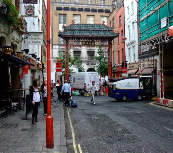
During the next stages of editing, I want to start the footage of London where we see the group of boys travelling around the city. I want to include character exposition by introducing close ups of john nearing the end of the sequence. The continuity of the piece is vital, we have footage of the day and footage of the night, so the time lapse of the sunset will be situated between these two sections. As the track is quite fast, the cutting rate of this has to be supporting the sound, and the cuts in the sequence need to be matched with the tracks tempo and dynamics.

LF: Camera


We are using a Cannon 600D camera; 18-megapixel CMOS sensor:
 
  • Scene Intelligent Auto mode
  • Full-HD EOS Movie
  • On-screen Feature Guide
  • Up to 3.7fps continuous shooting
  • Wide-area 9-point AF
  • 1,040k-dot vari-angle 7.7cm (3.0”) screen
  • Basic+ and Creative Filters
  • Built-in wireless flash control

  • There are different modes in which you can film. Sports mode allows you to capture movement with no blur, whereas portrait mode allows you to capture close-ups with the correct focus. Manual focus can allow you to smoothly change the focus, from deep to shallow or vice versa.  This camera helped us greatly in achieving the quality and the picture we wanted. This camera also helps us film in low key lighting conditions with out the need for flash. There is a manual control over frame rate, which could allow us to change settings to shoot in ultra-slow motion. 14-bit DIGIC 4 image processor in the heart of the camera allows colour reproduction, smooth tonal gradation and tight control over noise. Relating to our digipak and advert, an APS-C sized, 18-megapixel CMOS sensor captures images that are packed with detail and clarity. Such high-resolution allows large print sizes and the flexibility to crop pictures for alternative compositions.

    Wednesday 13 November 2013

    CJ - Print Ideas


    • These initial print ideas show the style and layout in which we wish to choose. We believe that with the genre of our track being mainstream dance, our digipak and magazine ad must be simple yet eye catching, making the use of bright colours, high contrast and bold font in order to grab the attention of readers.
    • We wish to use stills of the location the video is set in to create a cohesive campaign across the artists work. This is due to London being a famous place on the map and has many monuments in which we can make use of.

    CJ - Project Update

    • Today we decided on the final ideas for our video, detailing everything we wanted to see within the narrative and how we were going to achieve it.
    • We decided the story would about a young man's journey into the pain and fight of cancer, cherishing his last moments and reflecting on the past.
    • The video includes the introduction which will be a small prelude of the character breaking the news to his friends that he has cancer. We also need to shoot the ending of the video showing the character lying on his bed reflecting on his life and coming to grips that his future is no more. After this there will be a scene of his 3 mates standing over the grave of the character, showing a sudden death of the character and ending the story once and for all.
    • We plan on shooting the introduction tonight at 19:00 in the local hospital car park (Pembury). This will involve the character walking towards the car in which all his mates will be waiting in. The young man gets in, closes the door and breaks the news to his mates showing the pure shock and heartbreak between all the close friends.
    • Throughout the sequence we wish to show the characters earlier life as a child, flashbacks to the times he was happy and thought he had a whole future ahead of him. By doing this we believe it will pose a stronger message to the audience, making the narrative seem more chilling and cold, reinforcing the idea that a young man's life is coming to an end.
    • Print work is coming on nicely, with the group close to achieving a finished plan for the digipak and currently working on the images to match our ideas. The digipak will incorporate stills we took when shooting in London and will be layered with images of the young man's grave for the front cover.

    Tuesday 5 November 2013

    LF: Album Cover Ideas


    Group - Feedback on 1st shoot

    On Monday 4/10/13, we travelled up to London in order to film our narrative. In general we got a lot of footage with varied camera shots and angles. Furthermore, as well as shooting for our narrative there are plenty of establishing shots and filler shots which will enable our video to have good length.

    Wednesday 30 October 2013

    JV - Digipak Cover Ideas


    • The two designs above both incorporate the same ideas in which the location, London, is seen as the most prevalent.
    • The contrasting colours relate to the music in which one depicts forlorn colours to link with calm music but the altered threshold on the second picture juxtaposes the other


    ADVERTISING

     
        • Opposed to the digipak designs, the advertisement is for a 1 page spread in a magazine and instead of the location being prevalent, the record company, TIGERMILK RECORDINGS is the main motif which the target audience see.

    Friday 25 October 2013

    Group: Animatic


    The purpose of this task was to get an idea of what angles, distances and movement we need and the variety of shots needed to get an A.
    Firstly we drew the narrative in order showing the different locations and the narrative in them. Then we filmed the sequence with a school camera and tripod, before editing it on Premiere. We also added in some stills from the internet, and a piece of footage from a previous school visit to Brighton, of the Ferris wheel, which is meant to represent the London eye.
    From completing this task, we learnt that we need a lot more footage than we had planned, and more different angles. Nearly all the shots are tracking shots, but we also need to include more than just tracking in every shot, for example canted angles or close-ups.

    CJ - Actors/ Mise en scene

    Characters: Connor's sister & her boyfriend.
    Costume: Girl - Summery, bright clothing (very feminine).
                     Boy - Smart, dapper clothing contrasting to dressed down jeans & top.
    Action:
    • Taking pictures in famous places
    • Holding hands walking down the mall
    • Cuddling on the London eye
    • Eating ice cream (Ben & Jerry's Scotchy scotch scotch).
    • Shopping
    • Boat trip
    • Driving around
    • General messing around
    Movement: The movement of the characters needs to be natural and flowing, persuading the audience that the couple where once madly in love.


    Thursday 24 October 2013

    Group - Music Video Shoot

    We plan to film mainly during half term as it provides us with a lot of free time in which to film, this also lets us to get a range of different shots like time lapses as we have the freedom to do so.
    The dates in which we plan to film are: Monday - 28-10-13 and Thursday 31-10-13, by filming on these dates it will provide us with enough footage to collaborate together for a large chunk of our production.
    In terms of cast we are planning to use casts provided by Connor which could be subject to change as we feel if we perform these roles then there would be less verisimilitude and downgrade the quality of our music video. By using someone older then it is easier for them to understand certain directions and acting roles.
    Obviously we have to think about certain risks and difficulties that we will face, this will include things such as rain in which the weather conditions will not be the best on the day but our similar which is needed for continuity; certain precautions we will have to take is protecting the equipment during filming by filming under shelter be it a building or an umbrella.

    Wednesday 23 October 2013

    CJ - Dubai Shoot

     
    Date: 26th October - 1st November
    Location: Dubai (burj al arab/Khalif, Atlantis)
    Character(s): Young woman
    Costume: Summer clothing, vibrant.
    Shot Ideas:

    Monday 21 October 2013

    JV - Concept Development, Itininerary

    The following route in which we are taking to London will allow us to cover enough vast space to look at a lot of popular monuments and areas which are easily recognised and appeal to a larger audience.
    Furthermore, the different areas and locations means the shots in which they are angled and framed in are varied for example, walking down to Westminster Abbey towards Big Ben and the London Eye will be good for over the shoulder shots and longshots into the distance however going to places like SOHO  and Chinatown can provide a lot of close ups from the different markets and shops that are there.
    In order to create verisimilitude and continuity, the days in which we go must have similar weather conditions, preferably on a day in which there is no rain which causes a lot of problems in terms of risk assessments but on a cloudy day which truly reflects the usual conditions in the UK and especially London.


    As seen above this is the plan for the day in terms of where we are going which provides an easy to follow route which is convenient and provides many different places which are on the way such as St James' park and the Mall which are directly next to each other on the way to Buckingham Palace.

    Shot ideas;
    Long shot with monument in background
    Tracking shots
    Close ups, street performances, market stalls/stands - Camden Market


    London 1st Shoot Planning

    Friday (25thOctober)
    • Weather: 15-20 degrees. Cloudy with showers/ bright spots.
    • Start time: 05:00am End time: 22:00pm
    • Transport: (Train/Underground)
    • Equipment: Camera, Tripod, Track.
    Locations:
    • Buckingham Palace
    • London Eye
    • St.james' Park
    • Trafalgar Square
    • Tower Bridge
    • Thames
    • Shard
    • Canary Wharf (Long shot)
    • Covent Gardens
    • Oxford Street/ Regent Street
    • Gherkin
    • Houses of Parliment
    • Leicester square
    • London Zoo
    Route:
    • Charing Cross > Trafalgar Square
    • " > leicester square
    • " > Covent Garden
    • " > Regent st./ Oxford st.
    • " > Buckingham Palace (via the Mall)
    • " > Big Ben/ London Eye
    • " > London Bridge/ Tower Bridge (via Underground)
    • " > The Shard

    Thursday 17 October 2013

    LF: Update

    After just editing the Brighton footage and gaining an idea on what shots were good and shots we liked, we have been introduced to the software 'After Effects'. As we want to use slow motion, after effects can make extra slow motion footage out of a camera that is incapable. Furthermore, picking key points in the screen and making a border, can set the footage to a smooth track,  rather than a handicam track, so it just takes out the unsteadiness. Also we have been looking at adding saturation and desaturation to the image to create moods. This will help our music video greatly in achieving a different colour between the two narratives and help the audience understand it better.

    Sunday 13 October 2013

    LF: Brighton Footage


    Group: Pitch


    Feedback: Class Presentation

    • When presenting the pitch to the class one response was to go to the location and get some shots and a location reccie that will determine whether the location is suitable to film or not.
    • We need to make it clear to the audience that there is a clear difference in the two narratives and we need to make sure the audience understand that.
    • Is the track to long and will we have enough footage to fill the 4.14 minutes that our track is?
    • Will we be able to find an actor in time to start filming?
    • Getting up to London early enough to catch the sunset in the right location is going to be a difficulty
    • The class suggested that we need to have an idea of what we want to include on the advertising side of the project. What image? What font?
    • The teacher asked if we know enough about post production effects to create the two different saturations of the narratives.
    Targets:

    • Go to London in the next few days to capture some shot ideas and some footage.
    • Learn about after effects with a media teacher to understand the different effects you can achieve in the software.
    • We may need to cut the track down a little bit. There is about a 1 minute repetitive part of the track which wouldnt hurt being cut.
    • We need to find the right actors - a couple that are together in a serious relationship and a bit older than ourselves to make the video more authentic and realistic.
    • We need to know exactly where we are going to go in London so we are going top get a map and circle the different locations we want to shoot at so time is used effeciently.

    Friday 4 October 2013

    Group - Story Board


    • The story board shown above is the basic scene framework of our current concept. It begins with a few establishing shots of the location and life that the poor protagonist is living in. The narrative then moves on to the life of this poor man, putting the audience into his eyes and living his life.
    • The narrative is about the highly contrasting lives of society, with each social class seeing one-another and the camera changing into that individuals shoes. The storyboard gives the group an idea of what it may look like when finished and will help to identify any weak areas.

    JV - Digipak Analysis


    Tuesday 1 October 2013

    feedback - 1 October

    Some very competent analysis on the blog. The presentation of some of the posts needs work in that images are needed. There are a few posts missing which need to be uploaded asap. I like the development of your concept, you will need to do a location reccie next though to ensure your locations are realistic.

    LF: Treatment

    • The music video is going to start with a deprived poor citizen of London, waking up shot in a sequence of close ups and birds eye view.
    • He walks out the house into the Camden area which is seen as run down and not very classy. There will be a variety of shots that reinforces the idea he is poor; such as worms-eye and tilt up. There will also be establishing shots of London's landscape. We will have POV shots of the deprived citizen walking through the market, with the large crowds just walking by and not taking notice of him.
    • Then there will be a crowd shot and he will make eye contact with someone that is of a higher class than himself. Over the shoulder shots, POV and Tracking shots will be used to switch character then the new character will take us through the motions of being a middle class citizen.
    • Still shooting in the day, there will be establishing shots, worms-eye view, tracking, POV, and canted angles looking up at the towering building structures. We will be hoping to capture the famous places of London throughout the duration the middle class citizen is in frame.
    • The next change will be between the middle class and upper class citizens. This will take place in a restaurant, when the middle classs person is sitting down and a POV tracking shot of the upper class person walking in stimulates the change. This change over will be shot at dusk.
    • The upper class citizen will be shot at night, with some sped up shots of the traffic and lights.
    • The citizen will go to the rich parts such as Chelsea and Kensington, and enter posh bars and casinos etc.
    • The last few moments of the track are slow tempo and we have decided to shoot the wealthy citizen driving a sophisticated, expensive car through the streets of upper class London shot in slow motion, and have the lights blurred across the scene. This gives the audience a chance to realise that the upper class person has been successful and is now enjoying the high life.
    • The swap between the three citizens represent the different classes in life. The idea is very disjunctive to the music, lyrics and audio, but there is a narrative which the audience can understand and the message delivered can be interpreted in different ways.

    Monday 30 September 2013

    CJ - Promotional Print Examples


    •  All the promotional prints in which disclosure release all show a trend, subtly showing a fixed structure throughout. When looking closely at multiple prints it becomes apparent that the boys are always placed in the same positions, with the same artist being placed in front of the other. This goes back to the early image of the boys when they were young, sitting in the chair where the same layout is seen.


    • The band are known for their simplicity and are all about good music. This is evident in the posters, album covers etc in which they release, using the same simple, bold font and keeping the information as small as possible.
    • The groups trademark is a white outlined face over the top of the artists faces. This is recognised with the band and so is always present.